In a bygone era, each image posted to an organization’s website might have been carefully produced by a graphics specialist who used high-end software like Photoshop to crop and scale and optimize the image — but in today’s fast-moving world, generalist staff are often asked to manage this process themselves, even if they’re sitting at a laptop in a cafe or holding a tablet at an event site.
Challenge
I was recently asked to build a tool for a feminist advocacy group that uses ActionKit, whose staff needed to be able to quickly produce image elements that were scaled to specific dimensions to fit into the spaces allocated in their page templates.
Solution
The solution was a 500-line block of HTML and JavaScript code that leveraged an off-the-shelf open-source image-processing library. The custom widget was deployed via a dashboard in the ActionKit admin interface, and because it was running in this authenticated space it could leverage the ActionKit API to fetch lists of previously-uploaded images for further processing, and to push newly-cropped images through ActionKit to the S3 buckets at Amazon AWS that they used for static-file hosting.
Walkthrough
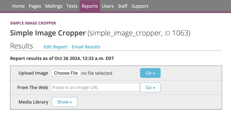
When first loaded, the cropping widget presents a simple interface with three ways to select a source image:

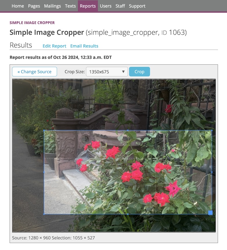
After an image has been selected, a cropping interface allows them to select an area of interest, optionally constraining the aspect ratio to match the dimensions of needed for one of their site layout elements:

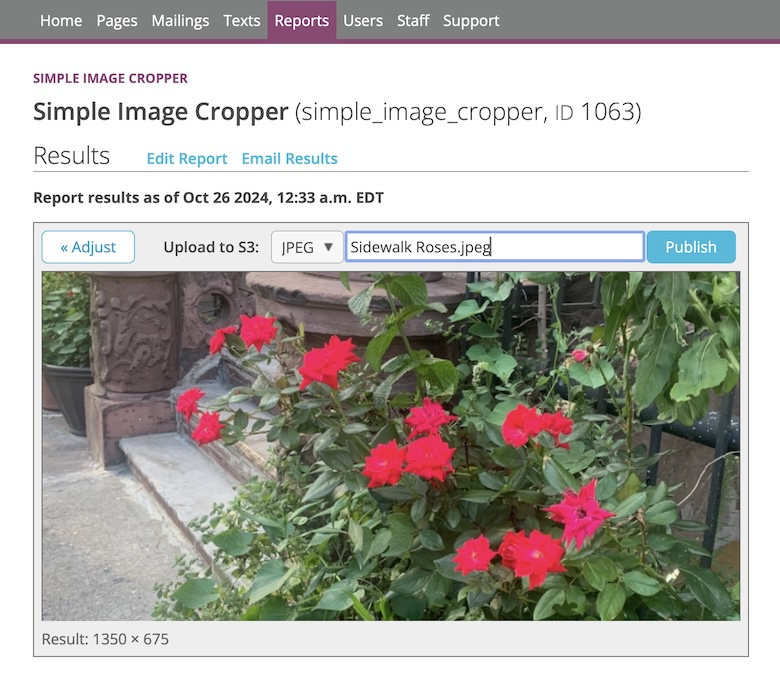
Once the desired area has been selected and the crop button has been clicked, the image is cropped and scaled to the target size, and the user is given a chance to adjust the file name and format:

After the final click, the image is uploaded to the site’s S3 bucket and the corresponding URL is presented so that it may be pasted into the relevant field of the page or mailing admin:

Leave a Reply